


Why Your Online Shop Needs Product Reviews
Product reviews can have a big impact on your online shop. Whether it's conversions, building trust, or SEO, learn why your shop needs product reviews.
The goal of your e-commerce site is to lead a shopper to complete one task — purchase an online product. The user experience is one of the most important factors that will determine how easily your online shop meets this goal, and the only way to offer an outstanding user experience to your visitors is through good design.
Design is much more than mere decoration. As Steve Jobs eloquently put it, design is “not just what it looks and feels like” it is also “how it works”. Professional web design will not only make your online shop look nicer, it will also determine the experience your users have on your website.
In fact, a professionally designed e-commerce website will be intuitive, engaging and fun to navigate. A really good design will improve the whole user experience and impact your main KPIs - such as CTR and bounce rate - and, ultimately, net revenue.
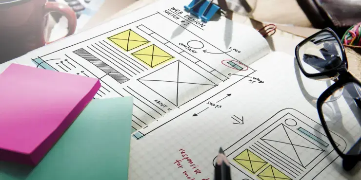
But how do you create a great online shop? Here are 10 tips to design an e-commerce site that will provide users with a great experience.
No one likes landing on a website and being unable to understand where they can find the product they are looking for. To avoid frustrated visitors bouncing back to the Google search results, you should organise your website in an intuitive, standardised way.
More often than not, products on e-commerce sites are divided into different categories, which are displayed on a menu bar located either on top of the page (but below the logo) or on the left hand-side.

Designed by akdcreative on 99designs
Filters also play an important role in making it easier for potential customers to find what they are looking for – be it a certain size of shoes or a specific iPhone model. Make sure it is possible to add and delete filters easily and without forcing the user to go back to the homepage. Also, every e-commerce site should have a search bar, which should be visible to everyone and is generally located in the top right corner of all pages.
The biggest difference between an e-commerce website and a real shop is that the visitors can’t feel and touch the products they are going to buy. Make it easier for them to understand what a product looks like by using high quality images, which should display the product from different angles. Interactive pictures, which make it possible, for example, to see a piece of furniture in 3D or to take a look inside a book, can really go the extra mile.

Designed by valrazan for HannesPP on 99designs
Product descriptions also play a central role in helping the customers choose the right product for them and they add an element of trust. Descriptions should be brief and on point, but long enough to encompass all the important features of the item. Also, they should be as truthful as possible, as this should contribute to a lower number of returns.

Just like every printed catalogue or magazine, online shops also need a visual hierarchy. The features of each and every element, such as its size and colour, as well as spacing and the overall layout will determine what gets seen and in what order, and what gets perceived as more important.

Designed by Fenixo on 99designs
Colours also play a crucial role in determining the visual hierarchy of a web page. Generally speaking, strong and vivid colours like red and orange are best used for central elements like CTAs and buttons as they will attract more attention than neutral colours like white and beige, which are much more applicable as background hues. Using colours on opposite ends of the colour wheel can often be a really good tactic for creating attention when placed next to each other.
There is nothing worse than finding the item you have been looking for just to discover that it won’t be delivered until next month. It might sound basic, but keeping your e-commerce website up-to-date is crucial for an optimised user experience. Remove or clearly tag items that are not in stock so that you’re ensuring a smooth journey for your customer.

Shutterstock/Rawpixel.com
As for any other website, there is no point in having a beautifully designed online shop if it doesn’t get any traffic because it doesn’t show up in the Google search results. Hiring an SEO Manager or following basic SEO best practices is a great start to making your website searchable and visible in the SERP.
Optimise your site for relevant keywords by including them in all title tags, H1s and meta-descriptions. Keep the product descriptions updated and make sure to constantly publish fresh content – either through a blog or a news section.
Also, add social media buttons to make your content shareable and increase social signals.

When buying a product from an online shop, people usually tend to go back to websites they trust because they have already used them and they had a great experience with their service. Too many scams are still floating around the internet and it is often hard to understand if a website is trustworthy or not when purchasing for the first time.

Designed by Paul Lorenzo on 99designs
Although a great customer experience always speaks for itself, testimonials and customer reviews are a great way to make your website more trustworthy and to give a personal touch to your products. Implement a review system through which users can evaluate both your products and their experience on your website. Also, use customer testimonials to highlight your strengths and promote a personalised shopping experience.

Designed by Paul Lorenzo on 99designs

No other element is more underrated on an e-commerce website than the call-to-action buttons. CTAs will help you drive your visitors down the funnel and convert them into customers. In this way, they will directly impact CTR, conversion rate and net revenue. Therefore, CTA buttons should be carefully placed and designed.

Designed by Mica Porto on 99designs
All CTA buttons should be visible, clickable and their colours should stand out on each-and-every page. Also, their wording should be short, on point and should include an action verb, as in “buy now”, “add to cart” or “pay with PayPal”. Take, for example, our logo design page. The “Get a design” button contains an action word ‘get’ and notice that it is the same size as the header text to emphasise its relative importance to the user.
Nothing makes your online shop more trustworthy than an effective branding strategy. While building the credibility and personality of your brand on social media, in offline media and through all your marketing channels, make sure that your website is compliant with your brand guidelines and visual identity.

Designed by FusionTrek on 99designs
The logo is the most important visual component of your brand and should be clearly placed in the upper part of your website – generally, as a best practice, in the top left corner. Also, the colours and fonts you choose should be specific to your brand and consistent through your website and marketing materials – from e-mails to flyers, from display banners to print ads.
While building your e-commerce website, make sure you try to keep the funnel that your visitors are expected to go through as simple as possible. Get rid of redundant pages, shorten the check-out process, and reduce it to the minimum. With every extra click, you lose some of your potential customers.
Spotify mentor, Tina Roth Eisenberg, suggests that you should “make it easy to purchase something. Don’t have someone click ten times to get to a shopping cart and then click another ten times to check out. Make sure that if somebody is interested in your product that they can check out quickly and efficiently and the order is on the way.”
Last but not least, remember to A/B test every change you make on your website. Be critical when reading manuals, best practices and blog articles (this one included!) and be aware that something that works for other online shops might not work for yours. There are several tools, such as Optimizely or Unbounce, that will help you test landing pages and other elements. Before implementing a major change across the whole website, make sure to test it on one single page and to take some time to evaluate the data.
In conclusion, web design plays a crucial role in e-commerce. Navigation, visual hierarchy, branding – all these elements have to be carefully planned and designed by experienced professionals. In order to create an online shop your customers will love, it is necessary to work with a professional web designer, who, together with your web developer, will give your visitors the best user experience they have ever had.