


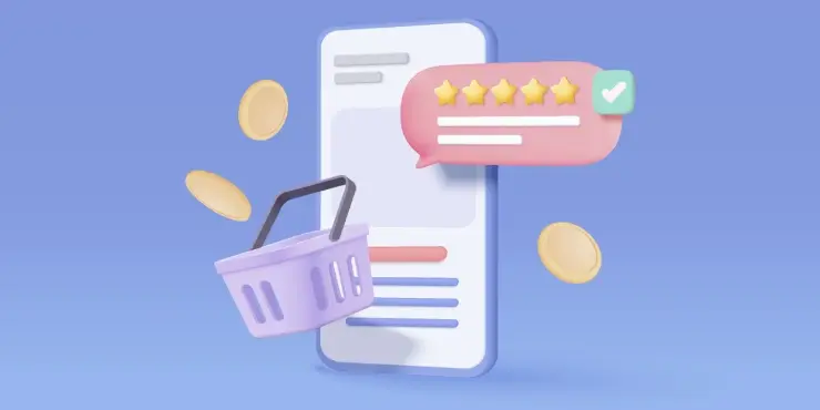
Collect and Display Reviews Effectively to Sell More
Learn best practices for collecting and displaying customer reviews to enhance your shop's visibility, boost conversions, and build trust with shoppers.
No matter what kind of business you have, the goal of your online shop is to get customers to make a purchase. And one of the best ways to get customers to make a purchase?
Design.
Table of contents:
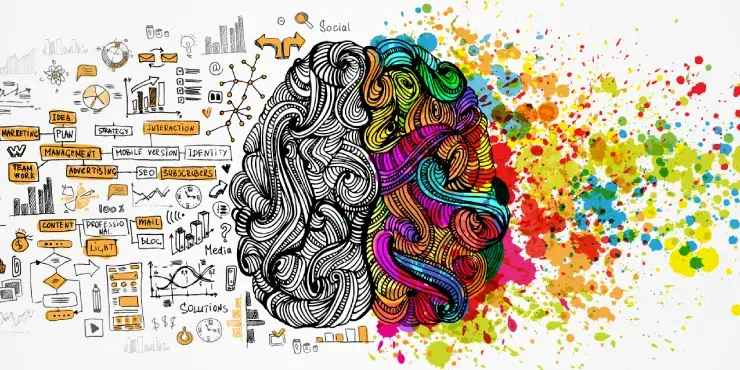
Design is about more than what your customers see. It’s also about what they feel, and those feelings are what’s going to inspire them to make a purchase. By understanding how design and psychology are connected, you can subtly influence your audience with your design—and drive up your sales in the process.
We’ve come a long way in understanding the psychology of design. Back in the day, the trend was to squeeze as much information as you could possibly fit onto the screen (SHARE EVERYTHING!) Just take a look at the 99designs homepage design from just a few years ago in 2010, which has so much going on it’s hard to know where to look:

Source: web.archive.org
Now, we know that simpler is better, and focusing on user experience (vs. trying to stuff as much information as possible) is a much better way to approach design, with a focus on using subtle psychological cues and neuro-scientific data to influence your audience and get the results you’re looking for.
But what, exactly, does that look like? How can you use psychology in design to understand what your customers want before they do — and drive a ton of results in the process?

Reformation keeps things simple with plenty of white space, a minimalist menu bar, and unique product photos.
When it comes to design, you might think “the more choices, the better.”
But nothing could be further from the truth.
Too many choices can actually give your audience “analysis paralysis,” rendering them completely incapable of making a decision (this is backed up by Hick’s Law, the psychological principle that proves that the more options you give a person, the longer it takes for them to make a decision). This can have serious implications on an online store; if your customer has 10,000 category pages to choose from—all of which are listed on your home page—it can become overwhelming… and that overwhelming feeling can steer them all the way to the “x” in the top right corner.
When it comes to designing your shop, simple is always better. Your logo design should be straightforward and not have too many competing design elements (colour! Texture! Different Sizes! Graphics! ALL THE FONTS!) Your products should be laid out in a simple, easy-to-navigate style (like a grid). You should keep categories to a minimum.
The simpler you keep your design, the easier it will be for your audience to navigate and the more likely they are to make a purchase.


Source: CapitalOne
Capital One uses colour psychology to its advantage by incorporating a ton of blue into its design—a colour most people associate with trustworthiness.
There’s much more to colour than meets the eye. And if you understand the psychology of colour, you can use it in your store design to influence your audience and inspire specific sentiments, feelings, and behaviours—and sell a ton of products in the process.
The colours you choose for your online store say very specific things about you and your business and have a lot of influence on how your audience perceives you. So, for example, if your online store is decked out in neon yellow and pink, it’s going to send a completely different message than if your design were all in muted neutral tones. If you don’t understand how people perceive colour, you risk sending the wrong message to your audience.
People perceive certain colours in different and specific ways for a myriad of reasons. Some colour perception is a direct result of adaptations made during evolution. Some are cultural associations (like associating the colour pink with girls and blue with boys), while others are more personal in nature (if my favourite colour is purple, I’m going to be drawn to stores that use purple in their design). But when you have a clear understanding of the way people perceive and interpret colours—regardless of the reason—you can use it to your (and your store’s) advantage.
But what, exactly, are some of the most common associations people have with colour?

Shutterstock/Kirasolly
When you understand how people tend to perceive colours, you can use it to maximise the effectiveness of your design.
Does your store sell financial products? If so, you’d want your audience to perceive you as trustworthy and dependable, making blue a solid choice.
Do you sell children’s products? If so, using friendly, youthful colours like orange, yellow, and pink will appeal to your target audience.
Want to make products fly off the (virtual) shelf? Incorporate red into your sales pop-up, since all that passion and excitement can inspire people to whip out their wallets.
Moral of the story: colour is a powerful thing. And when you understand the psychology of colour, it’s a powerful tool for influencing your audience.
There’s a very specific way your customers view your website. And if you understand the way they view your content — and design strategically around it — you can drive more interactions (and ultimately, more sales).
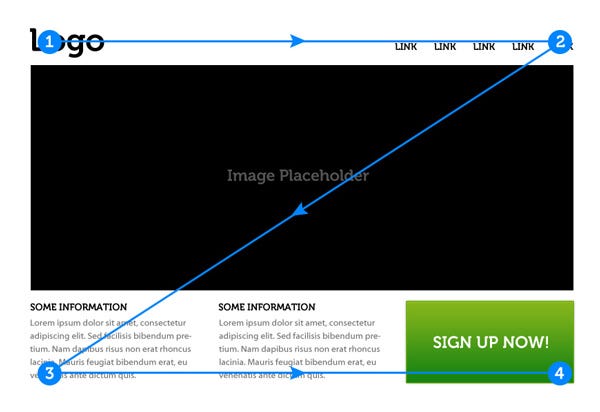
“Eye tracking” is a science that dates back to the 19th century, but really started to gain momentum as a field of study in the 1980s. Researchers wanted to know how people view a page and where they’re likely to focus their attention. And what they found is that there are two main patterns people use when viewing a page (or, in your case, a website): the F pattern and the Z pattern.
![]()
(Source: www.99designs-blog.imgix.net, via Nielsen Norman Group)
With the F pattern, users first scan in a horizontal movement (typically across the top of the page); then down the page and in a second, shorter horizontal movement; and then in a vertical movement down the left side of the page. This pattern forms the shape of an “F.” People typically scan using the “F” pattern when they’re confronted with a page that is text-heavy or has a lot of information to process.
![]()
(Source: www.cdn-images-1.medium.com, via Tutplus)
The Z pattern is typically used when people are scanning a page that has less information and text. With the Z pattern, users first scan horizontally across the top of the page (from left to right); then diagonally across the page, and then back across the page to form a second horizontal line. This pattern forms the shape of a “Z.”
When you understand the way people are viewing your online store, you can organise your content in a way that naturally draws their attention to the elements you want their attention on. For example, if you have a visual-heavy page and know people are likely to scan it using the “Z” pattern, you can put your “Purchase Now” CTA on the lower right-hand side of the page.
If you have an informational page and know people are likely to scan it using the “F” pattern, you can be sure to add bold sub-headers, which will show up on the left side of the page, to ensure your customers don’t miss any important points.
When you know the way your customers are going to view your website, you can design your website in a way that maximises the results you’re looking for.
When you understand the relationship between psychology and design, you can use psychological cues in your design to subtly influence your audience and get the results you’re looking for. In fact, we do it on our website at 99designs.
If you look at our homepage, you’ll see we used the “F” pattern in our layout (and placed the “Get Started” CTA in the place where it would get the most action). We keep things simple on our category page so as not to overwhelm our audience with choices. And colour? Those choices aren’t accidental. In a nutshell, we’ve cracked the code on how to use psychology in design—and now, you have everything you need to do it, too.

About 99designs
99designs is the world’s largest on-demand design marketplace, connecting a global community of freelance designers with businesses of all sizes to complete their design needs. Created by designers for designers, 99designs began with a group of designers who were competing together to create the best designs. In 2008, that friendly competition grew into a unique design marketplace that has now become the world leader in online graphic design. 99designs is changing the lives of designers around the world by providing them with an opportunity to access customers globally, earn income, and build their portfolios. 99designs has operations in the USA, Australia and Germany.