


Collect and Display Reviews Effectively to Sell More
Learn best practices for collecting and displaying customer reviews to enhance your shop's visibility, boost conversions, and build trust with shoppers.
First impressions matter. This principle particularly applies when it comes to e-commerce. A website that is easy to navigate, has an appealing design and is adapted to the needs of the respective target group - these are just some of the factors that contribute to a positive UX of an online shop. But what does UX stand for, and what does it mean? What do you have to know about it, and how does it influence the success of your online shop? In this article, we’ll give you the answers to all these questions.
Table of contents:
UX is an abbreviation for “user experience”, which literally refers to a user or customer’s experience when interacting with a product or service.
In the digital world, it usually relates to interactions with software or websites - therefore, it makes sense that UX is of huge importance when it comes to e-commerce.
Creating a positive user experience for your customers is about making an online shop's website easy and convenient to use at every stage of the entire purchasing process.
In other words, a well-designed UX is one that makes it easy for the customer to:
Enabling the customer to make a seamless purchase makes it more likely for them to come back to your shop and less likely to move on to your competitors.
Recommended reading:
4 Ways to Turn One-time Shoppers into Repeat Customers
What's more, from next year on, UX will have a great impact on your website's ranking in Google searches. In May 2021, Google already rolled out a new update for its algorithm: the Page Experience Update.
Even though making it to the top of the search results and boosting traffic are some of your main goals, you still need to make sure that people buy your products as well. So how can you achieve this? This is where the UX decides your online shop’s fate!

Shutterstock/Rattanasak Khuentana
According to the definition we gave above, user experience is about the act of designing and adapting aspects like the software, interface, and content of a website in order to appeal to customers’ wishes and needs.
However, in order to actually implement this strategy, you first need to know your customers and target group as well as possible.
No matter how beautiful a website looks, it will never encourage customers to make a purchase if neither the usability nor the service is adapted to the needs of the customer. Thus, the design of an online shop that sells products from the fashion sector to mature women needs to have a different appearance than a shop selling trekking equipment or a toy online shop for children.
Having said this, before you commission a UX design (or do it yourself), you need to conduct some fundamental research first and find out who the most frequent buyers in your online shop are (sometimes it’s not who you expected!).
Recommended reading:
Creating a Buyer Persona to Better Understand Your Customers
Remember that this isn’t only about the graphic and visual elements like colours or the language and tone you use when directing content to the website’s visitors. It’s also about choosing the font size, which will prove useful for elderly people or people with visual impairments. In addition, using the website should be intuitive, and customers should be able to easily find a particular product and shouldn’t wonder about what happens when they click on a particular button on the website.
💡An increasing number of online shoppers are making purchases online using their smartphones or other mobile devices. This is something you need to keep in mind when it comes to a positive user experience. Make sure that your website is also fully displayed for users on mobile devices.

Many online shops welcome visitors with a so-called slider at the top of their homepage, i.e. a carousel browsing pictures. After clicking on an image on the slider, users are forwarded to a particular subpage.
If you implement a slider on your website, you can, for example, place information on current promotions and sales offers, direct potential customers to the most popular product categories, or announce new product arrivals.

Slider on the Kiko Cosmetics homepage
In the case of the slider shown above on the Kiko Cosmetics website, the image and the information displayed move automatically, reminiscent of a carousel. Interested users can click on any space of the slider to visit the page to get more details on a particular product collection.
You see, this is another important element of a slider: proper navigation. When using a banner (especially a carousel one) for your online shop’s homepage, make sure to include navigation symbols like arrows or dots (like in the image above) to allow customers to browse through subsequent images.
Additionally, they allow users to return to a particular slide they are interested in. However, keep in mind that the navigation symbols shouldn’t cover the content valuable to the customer.
When it comes to sliders, timing is essential. Allow your website’s visitors a few seconds to read the displayed content, and at the same time, try to keep the length of the slider’s content short. After all, you want your customers to be able to read it, but you also want them to see all the information on the other slides as well.
Another visual element you can use on your shop's homepage is banners. If you decide to use both elements, it is best if the banners are displayed closer to the page scrolling point, clearly below the slider.

The banners on Hatstore.co.uk show off unique products and product categories.
💡 Sometimes less is more. Therefore, avoid oversaturating your homepage with large visuals if they have no benefit for the customer.
Another aspect contributing to a positive UX is product images - both on the product page itself and on the product category page. First, of course, they should be of high quality, but shouldn’t take a long time to load either.
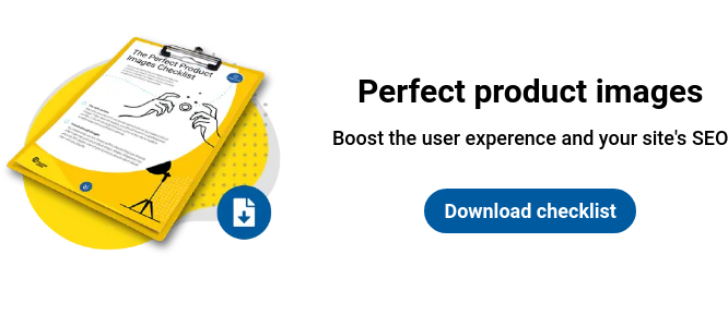
Let’s first start with the images that appear on the product category pages. Here you should show different variations of the product - for example, in different colours or sizes.
For a good example, look at the fashion marketplace, Zalando. When you hover the cursor over a given photo, below it, you can see information about other versions of a given product.

Product page on the Zalando website
This is also a nice strategy for showing the product in use - this is particularly important when it comes to clothing or footwear.
Instead of just uploading a photo of the dress, showcase it with a model. However, to keep the category page from being too monotonous, use photos in which the model takes different poses or in which another person appears, for example, as brands like H&M do:

Category page on the H&M website
You can also present the use of the product on the homepage itself - as IKEA did. There, we see photos with arrangements using furniture and accessories from the IKEA shops. If customers hover the cursor over a given piece of furniture, they will see its name, and after one click, they’ll be directed to the respective product page:

IKEA online shop
As for the product page itself, show photos taken from different angles. You can present them either as a carousel or in a static form, where customers select the most appealing images themselves:

Product page from Ahinsa Shoes
The product page also offers a nice opportunity to show your customers how to actually use the product you sell. Remember to give website visitors the option to enlarge the product image.
In order to further show the capabilities of the products they offer, some shops choose to include 360° photos or even short videos on the product page.
One of the key elements in order to have a positive impact on potential buyers, and thus increase conversions, is a well-built navigation bar. It should be visible on every page of your shop, and ideally, it should be at the very top of the website.
Make sure your navigation bar includes top-level product categories, a search bar, login or registration options for customers and a link to the shopping cart.
Recommended reading:
5 Tips for Making Your Website Easier to Navigate
As we’ve just mentioned, the search bar should be visible both on the homepage and on all of the product pages.
In order to speed up the purchasing process and to help customers find the item they’re looking for without much effort, add an autocomplete search feature on the page. You can also, for example, suggest a selection of products just by clicking on the search field.
This feature would then suggest phrases recently searched by other customers, but also suggest recently popular categories. Besides, examples of products corresponding to the search query can also be shown here.
A category tree that is properly built into the navigation bar is one of the key factors influencing proper navigation in an online shop. Remember that not every customer uses a search engine or enters your website with a specific product in mind - they may also look for inspiration or browse through your offers. That is why it’s quite important that the different product categories can be accessed from any place on the website.
The navigation bar should contain links to the top-level categories, i.e. the most general ones. After expanding the given category, shoppers should be able to narrow down the product group. Here, you can also highlight featured categories like "New season" or a winter sale:

The navigation bar on the Adidas online shop
Remember to adapt the category tree to your shop's current product range. This element should be kept up-to-date and flexible - after all, individual product groups may change over time.
The next natural step when searching for products in a shop is to filter them. How many filters should you include on the website? The answer depends on the product range, of course.
Choose filters that are the most intuitive for a given group of products - such as price (you can give the user the option to choose a range of amounts or use a slider to do so), colour, size, material, type or brand. One of the filters could also be to show only products that are currently on a special promotion.

Search filters in the Argos online shop
In the Argos online shop, users can even select filters to see products that have received a certain number of stars.
Recommended reading:
Show Your Star Ratings in Google Ads
Offering as many filters as possible is a benefit for the customer because it allows them to narrow down the search query as precisely as possible. However, beware of situations in which too many selected filters will result in displaying customers a blank page without any products found that fulfill all the filters selected.
Talking about search filters, another issue would be the location of the filter panel. Where on the website should it be located?
Usually, search filter panels appear on the left side of the page, but many online shops also decide to locate them above the list of products and display the filters in a drop-down format.
Because of this, customers don't have to move around the page to select search filters.

Search filters on the Adidas website stay at the top of the page as users scroll through the results.
Sorting the list of products according to the filters selected by the customer will also help in the search for the right product. An option to arrange products according to price, popularity, or user rating, for example, should appear at the top of the page.
A well-designed online shop in terms of UX is one where customers have access to their shopping cart during every stage of the purchasing process.
That is why it’s essential to include a link to it in the navigation.
Moreover, the user should always be updated on the number of products that are currently in their shopping cart. Also, customers should be informed about the total value. These are things that need to be automatically updated after adding new items to the cart.
It is good practice to show the items of the shopping cart after hovering over the relevant symbol in the navigation or to let the cart pop up when a new item has been added. The latter is exactly what has been done in the online shop below:

Shopping cart in the Zara Home online shop
In order to encourage customers to add more items to the basket, you might want to consider showing them a discount code, information about a promotion, or the chance of free delivery with a certain cart value. If you go this route, make sure they are visible on each subpage.
However, remember that information like this shouldn’t overshadow other important information. Instead, try using a different font colour or background, for example.

A banner at the top of the site invites you to sign up for the NA-KD newsletter.
The written word and textual elements are just as important as graphics and images when it comes to the UX of your online shop. In general, the concept of your online shop should be clear and communicated consistently. Furthermore, every element should be tailored to your target group, both on the home page and on the individual product pages.
In the first part of our UX series, you already learned how to present photos on the category page accordingly. Now, it's time to take a look at the textual aspect of your shop’s category pages.
First of all, you need to know that the most important issue is the description of the category. Why? It simultaneously informs your website’s visitors about the items found in a given category and thereby helps them navigate your shop. On the other hand, it helps search engines crawl and rank your website.
How long should the category description in an online shop be? Well, unfortunately, there is no definite answer to this question. However, your category descriptions should contain all relevant information about the products that can be found on the respective subpage, but it shouldn't be too long and lengthy.
Remember that it’s the usability that matters and convinces customers the most. That is why you should avoid clichés such as overdoing and excessively using saturation of the text with keywords that won’t tell your customers anything about the product, and instead focus on specificity and uniqueness.
Depending on the length of your category description, it needs to be placed in different areas of your website. Longer texts of several paragraphs should be located at the bottom of the page, which is basically the most common practice of online shops.

Category description visible under the listing in the MADE online shop
💡 It’s good practice to include links to other shop categories in the text, since it promotes the usability for customers and helps your website in terms of SEO.
It is also possible to have the category description above the product listing; however, it is quite risky. If you choose to do so, keep the text short enough so that the customer doesn’t have to scroll to see the products.
One of the pillars of UX design is to shorten the customer's shopping process. Therefore, it is worth giving the customer the option of adding a product to the cart when browsing through the category page, by placing a button with the appropriate add-to-cart-CTA or a similar icon.

When the user hovers over the selected product, an “Add to cart” icon appears so you can add it to the basket (in the lower right-hand corner).
(Source: IKEA)
❗ In order for category or product descriptions to fulfil their role in terms of both UX and SEO, they need to be unique.
After having had a look at the category page, the customer usually visits the product page. Normally, this is where the decision to add an item to the cart is made, which is why you should give as much relevant information about the product as possible. When it comes to the product description itself, it is worth limiting yourself to only a few sentences:

Short description on the product page in the Zara Home online shop.
You can, for example, present more details on an item - such as its dimensions or maintenance instructions - in a drop-down list:

The product pages for Hunkemoller allow users to read more product information by clicking and expanding that section (on the right-hand side).
As you can see in the example above, the product page isn’t only about presenting the product itself. We recommend that you include more information here as well (e.g. about the expected delivery date, the right to return or warranty, etc.). In other words, try to give customers any information that has value, and this will encourage them to make a purchase.
The call-to-action (CTA) to add the product to the cart must stand out from the rest of the text. How? The best way would be to have this button set in a different colour or design, or on a background that is coloured differently.
In order to convince the visitor to buy the product, you can also inform them about the quantity of products that you currently have in stock and about an ongoing promotion that will make the item more affordable. You should therefore definitely include promotional codes on the product page.

You can add the (discounted) product to the basket in the Soletrader online shop.
❗ If the item is sold out, make sure to let your customers know when you expect it to be restocked. Also, offer to send an email notification as soon as the item is in stock again.
The product page is a great place to use up- and cross-selling as well. Once a product has been added to the shopping cart, you can offer the customer similar or complementary items. At this stage, you could also give customers the option to continue shopping or move on to the cart to finalise the purchase. This is also something that will make the entire shopping experience quicker and easier.

A message pops up after adding the product to the basket in the Kiko Cosmetics online shop.
While the product page is the place to include as much information as possible in order to convince the customer to make a purchase, we advise you to opt for minimalism on the shopping cart page.
This is the page where consumers make the final decision on whether to complete the purchase or not. Therefore, too much information can distract them.
When it comes to the shopping cart page, the most important information is the summary of the order, i.e. a short presentation of all products (small product images and detailed variants, e.g. colours) and their price.
At this stage of the shopping journey, you should give the customer the opportunity to add another (or several more) of the same items to the cart, as well as the opportunity to remove them.
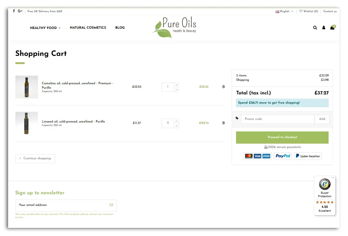
The shopping cart page on the Pure Oils website.
It is also possible to add a message informing customers about the missing minimum order value that will get them a free delivery. On the shopping cart page, you should also offer the opportunity to enter a discount code.
Furthermore, the customer needs to be informed about the total amount of the order (including delivery costs; the best practice would be to have the most expensive delivery option pre-selected, with the customer being able to change it during the checkout stage).
The shopping cart page of the online shop needs to be topped off with a visible and prominent button taking the customer to the final checkout page (e.g. "To Checkout"). If the subpage is large and requires scrolling, it may be worth placing a second button at the bottom of the page to facilitate usability. Alternatively, you can have the button remain fixed on the page as the user scrolls down:

The shopping cart page in the NewBalance shop has a high-contrast "checkout" button. It stays fixed as users scroll down the page to review their order.
It's time for the last, but very crucial element in terms of a successful UX design that will help you generate more sales - the checkout page. A checkout page that is improperly constructed, not intuitive, and has too much information will most probably discourage the customer from making the purchase and will make them abandon their cart. The same rules apply here as with the previous elements: avoid distractions.
When creating the customer journey in your online shop, there are two strategies to choose from:

One-step checkout in the Meaco online shop.
The advantage of the one-step checkout solution is the fact that customers can view all the necessary and required information regarding the order in one place, and don’t have to go back to any page.
It only takes a few clicks to complete the transaction. On the other hand, however, all this information in one place may simply overwhelm the customer, and the entire page may become unreadable.
It is difficult to say which solution will best fit your online shop. However, running an A/B test may help provide you with the right answer.
Many customers think that registering and setting up an account in an online shop will give them additional benefits (e.g. special offers or allowing them to track the delivery).
However, many customers associate this procedure with an additional, unnecessary part of their shopping journey. If customers discover that registering in your online shop is compulsory, they are more likely to abandon their shopping cart.
Therefore, the basis for a positive and appealing UX design is to offer your customers the possibility to make a purchase as a guest. This doesn’t mean, however, that you cannot encourage customers to register - e.g. by offering a discount on the first purchase after registering an account or signing up for your newsletter.
What to do? The best way would be to divide the first page of the checkout process into three parts:
Look, for example, at how H&M does it:

H&M offers three different options in their checkout: Login, signing up as a new customer and guest checkout.
💡 To shorten the registration or login process even further, you could, for example, integrate your shop with Facebook or Google. This way, users can become your customers with just one click.
When it comes to the registration form or the delivery address (in case of choosing to continue as a guest) - make sure that customers only need to provide the most important information. Opt for minimalism here as well. Too much personal information may discourage the customer from completing their purchase.
The next step, after logging in or registering, should be choosing a delivery method for the order. Show all available options and their costs, as well as the estimated delivery date.
Recommended reading:
Click & Collect: Giving Your Customers More Options
The next step is to allow your customers to choose their preferred payment method. When it comes to this aspect, the same rule applies as with the delivery method: Let your customers know about the costs of particular options in a simple and clear way.
Remember that the more payment methods you offer, the more reliable and trustworthy your online shop comes across to the customer.
💡We recommend that you include the contents of the shopping cart on both the delivery and payment method selection pages, along with the total cost of the order.
You did it! The customer has decided to buy something from your shop. To show appreciation for their decision and at the same time to reassure them that the whole shopping process went smoothly, you need to redirect them to a page displaying a summary of the order (all the items purchased, the chosen payment and delivery method). Make sure to send out a confirmation email as soon as possible after the transaction has been completed.
In addition, it would be nice to have a little thank-you message displayed. Thank your customers for choosing to buy at your company.
If the customers decide to make the purchase as a guest, you can offer to register again and mention the benefits of doing so, as well as encourage them to visit your social media profiles.
You already know that a positive UX has a huge impact on the perception of your online shop and your sales. But how do you know if your website actually offers a great user experience?
The best way to check the UX of your online shop is to conduct a little survey and ask customers what they think. It's worth repeating the little questionnaire for each stage of the shopping process to avoid negatively affecting your website’s usability.
Recommended reading:
What is Your Net Promoter Score (NPS)?
But how do you get customers to become your UX “testers”? Encourage them to test your website by sending an invitation to take part in tests in your newsletter, social media or by placing information on the homepage itself, and then organising a remote UX test (e.g. using a webinar application).
By asking relevant, specific questions about, for example, the location of a particular button, you will get important and useful feedback and suggestions. If your budget allows it, you could also outsource the UX audit to a specialised agency or hire professional testers.
To make your usability design efforts effective, it's worth monitoring customer behaviour on an ongoing basis - Google Analytics might just do the trick.
Check at what stage users abandon the shopping cart, whether they click on specific elements in your shop, and note changes in behaviour after introducing changes on your website.
It is also extremely important to adapt the mobile version of your shop - remember that what works on a desktop will not always be as effective on a smartphone. Keep up to date with what your competitors are doing.
Remember that investing in a positive UX is a way to attract new customers, keep them on your website, and even become repeat customers.
The better the shopping experience you offer, the better your online shop will perform and the more sales you will be able to generate.

This article was originally published and translated from our Polish blog: Co to jest UX i dlaczego jest ważne dla Twojego e-sklepu?
03/08/21

Agnieszka graduated with a degree in Journalism and Social Communication from the University of Wrocław. She took her first professional steps in the editorial department of one of the largest financial portals in Poland, then became involved in SEO and content marketing in the B2C sector. Since 2020, she has been working at Trusted Shops as Content Manager Poland.
Read more