


Collect and Display Reviews Effectively to Sell More
Learn best practices for collecting and displaying customer reviews to enhance your shop's visibility, boost conversions, and build trust with shoppers.
You never get a second chance to make a first impression. This applies perfectly to e-commerce, where your homepage is your digital storefront.
Within seconds of landing on your site, visitors decide if you’re credible, professional, and worth their time. Studies show that 38% of people leave websites with unattractive content or layouts.
In other words, your homepage sets the tone for everything that follows. Here are the e-commerce homepage best practices you need to know to get it right.
Table of contents
Your homepage is a strategic checkpoint in the buyer journey. Customers might find your products through search or social media, but many will check your homepage to evaluate your brand.
The best e-commerce homepages balance multiple goals. They showcase products, communicate value, build trust, and guide users to specific actions.
The hero section, also known as the "above-the-fold" area, is the first thing your visitors see when they open your e-commerce website. Use it to communicate your value proposition immediately.
Answer the questions every visitor has: what’s in it for me?
Avoid generic statements like "quality products at great prices". Focus on specific benefits that set you apart.
Do you have the largest selection of sustainable products, or offer expert customer support that competitors can’t match? Make these differentiators crystal clear.
Your headline should speak directly to your audience’s needs or pain points. Pair it with high-quality visuals that show your products in action or demonstrate the lifestyle your brand enables.
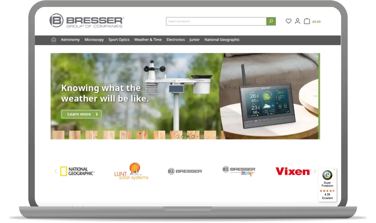
Source: Bresser UK
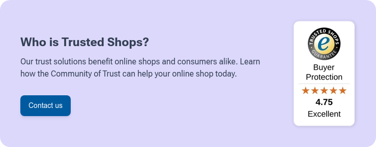
Trust is the foundation of e-commerce. Often, your homepage is where you first establish credibility with new visitors.
Reviews belong on your homepage. Display both product and service reviews strategically.
Displaying trust elements on the homepage can significantly impact conversion rates or reduce bounce rates.
Make it easy for visitors to find what they want. Your navigation should be intuitive and comprehensive without being overwhelming.
The navigation menu is the default option for most visitors. However, you can still add extra search bars or menus for specific product categories.
Is Halloween coming soon? Don’t make your site's visitors look for your bite-sized snacks! Create a separate drop-down in the hero section or highlight a special landing page in a banner!
Accessibility matters more than ever. Good navigation should work with any type of screen readers and assistive technologies. This will help your visitors, but also improve your organic visibility!
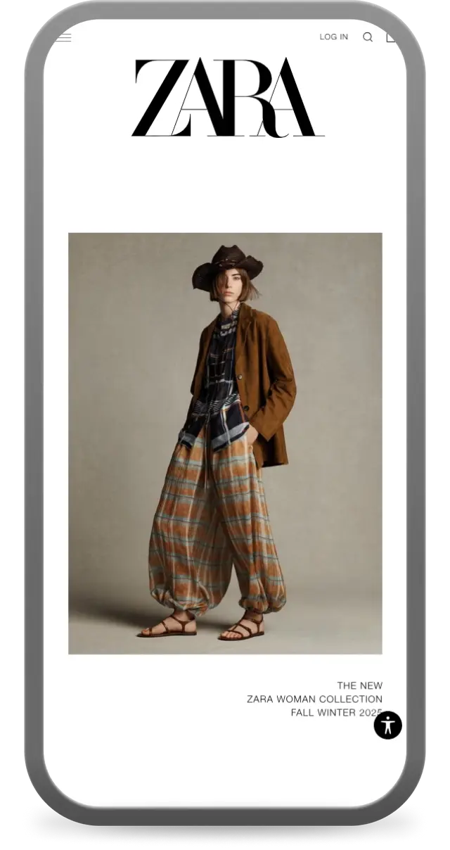 Mobile shopping behaviour is significantly different from desktop browsing. On mobile, you usually have less screen estate, so the content needs to be more focused. Check out this simple design from Zara's mobile site.
Start with the centre of the screen – or, the hero section. It should grab the visitor's attention immediately. Depending on the products you offer and your audience, it could be a video showcasing the current sale or a more conventional menu with common categories.
It’s worth mentioning that Google and other search engines are now mobile-first. This means that your SEO depends primarily on the performance of the mobile version of your website. Make sure it’s easy to read for robots!
Accessibility matters. Ensure that multiple elements, such as chat widgets, popups, or banners, don’t overlap or appear simultaneously, especially within the first 10 seconds. This is important in general, but even more so on smaller screens. Some of these elements can typically be disabled on mobile and only shown on desktop, which might be a helpful approach.
Recommended reading:
What is A/B Testing and Why Your Online Shop Should Be Doing It

Shutterstock/Tero Vesalainen
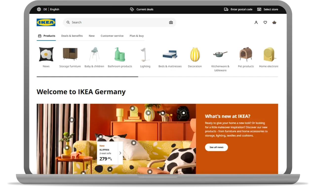
This IKEA homepage combines product discovery with direct purchase paths. The top navigation uses visual icons for each category - users see a pot icon and know it's kitchenware.
The hero section splits the layout: a stylish living room on the left, new product promotions on the right. Essential elements include a search bar, account access, the shopping cart, and a store selector.
The page uses IKEA's signature yellow and blue colours while offering multiple ways to browse products.
A visual category navigation removes the guesswork. Users instantly recognise product types without reading text menus.
The hero image shows products in real room settings, helping customers picture complete solutions rather than individual items. The What's new section creates urgency for return visits.
The top utility bar handles practical needs upfront – language, pricing, location, store selection – so users don't hit these barriers later.
The visual categories reduce bounce rates by helping users find relevant products quickly. Room-setting images increase average order values by suggesting related items.
The new products section keeps regular customers engaged. Store localisation features let users order online for home delivery or store pickup.
This homepage fits IKEA’s philosophy: It may seem simple, but it does exactly what it is supposed to. It converts visitors while encouraging deeper product browsing.
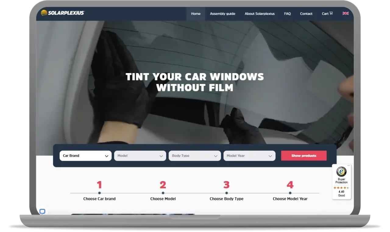
This Solarplexius homepage focuses on one clear message: Tint your car windows without film. The hero features a video showing installation and the before-and-after results.
Users are also greeted above-the-fold with the service rating in the Trustbadge widget (along with the Trustmark and Buyer Protection.
A 4-step product finder guides users through Car Brand > Model > Body Type > Model Year to find compatible products. Navigation covers assembly guides, company info, FAQ, and contact.
Below the hero, bullet points highlight key benefits. A review carousel shows the average service rating and a collection of recent customer feedback.
The video addresses the main customer question: how does this product actually work? Seeing the installation process and results builds trust immediately.
The 4-step finder solves compatibility confusion, a major barrier for automotive accessories. Users get exact matches instead of guessing.
The review carousel provides social proof when users are deciding to buy. The Trustmark and Buyer Protection also work to build trust with new users. Real feedback and third-party certifications counter any scepticism about an unfamiliar brand and its products.
Meanwhile, benefit statements like "Blocks 90% of direct sunlight and 15-minute installation" directly address customer concerns.
The video demonstration builds confidence in both product effectiveness and ease of use. The precise product finder increases conversions by ensuring compatibility.
Prominent reviews and trust signals convert hesitant visitors. The combination of demonstration, specs, and validation covers all decision-making factors.
Read more about how the Trustmark & Buyer Protection boost sales.
The single product focus prevents choice paralysis while the clear navigation supports different user needs, from first-time visitors to customers needing installation help.

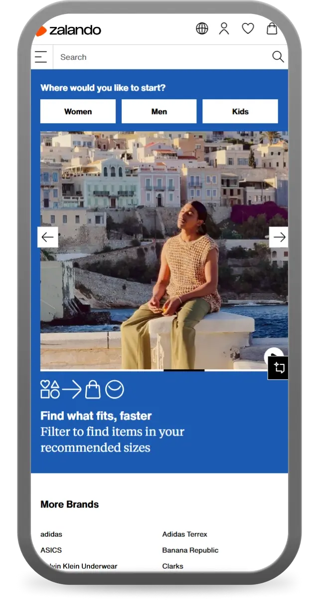
This Zalando mobile homepage uses a simple three-button approach: Where would you like to start? Along with Women, Men, and Kids options, the top header includes essential functions: search, account, wishlist, and cart.
The hero images show lifestyle photos with people in vacation settings, creating an aspirational vibe. Below, key categories are listed: brands, inspiration, deals, and at the bottom, a newsletter signup form.
The layout is clean with plenty of white space and a prominent search bar that takes up most of the header width.
The three-button start eliminates decision paralysis. Users pick their category and begin shopping immediately. This works better on mobile than complex navigation menus.
The lifestyle hero image sells the feeling, not just products. The vacation setting suggests the clothes will help users look good in their own lives.
The large search bar recognises mobile user behaviour. Many users prefer searching to browsing on small screens, especially in stores with as many categories as Zalando.
The simplified navigation reduces bounce rates by helping users start shopping faster. The three-category approach works for Zalando's broad audience.
The prominent search functionality caters to mobile shopping behaviour where users often search for specific items rather than browse categories.
The lifestyle imagery increases engagement by showing products in context rather than on white backgrounds. Users can envision themselves wearing the clothes.
The basics matter, but standout homepages go beyond the essentials. You want to capture different types of new and returning visitors and guide them towards multiple conversion paths.
Interactive features boost engagement and time on site. An example of such a feature is Find My Perfect Match quizzes that recommend products based on preferences.
What works best:
L'Oréal Paris is a great example here. Right under the hero section, you get a set of tools that help you try on different make-up options, hair colours, etc. – all directly on your phone.
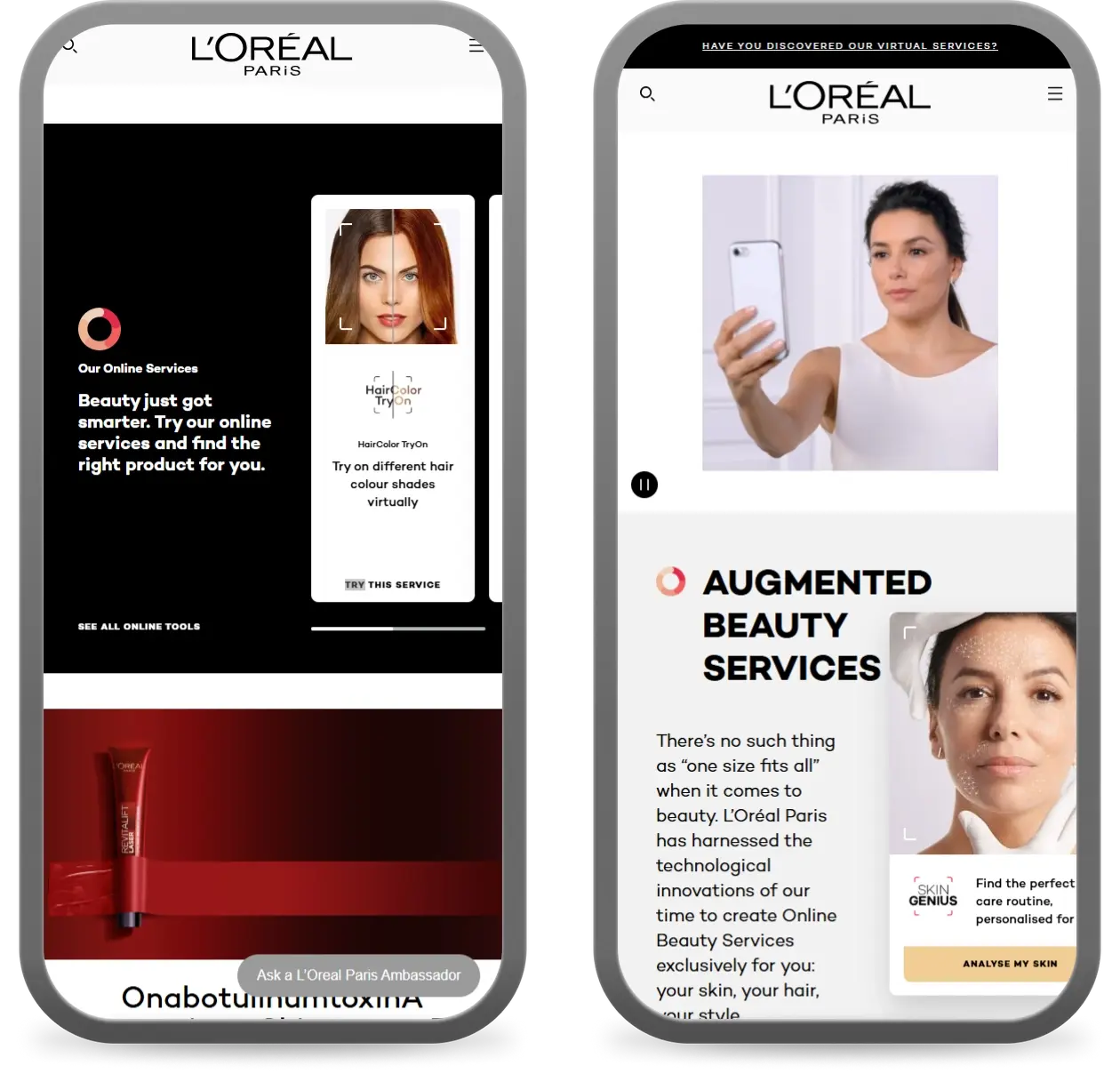
Interactive elements also collect valuable data about customer preferences without feeling intrusive. Use this data to improve your product recommendations and email marketing.
Seasonal updates keep your online store fresh and relevant. They also create urgency and FOMO that drive immediate action.
Again, your homepage is a great place to present them. One way to approach it would be to prepare specific homepage content for each significant holiday or event. Redesigning the entire store around the upcoming Olympics may not be a viable option – but what about a themed homepage?
As mentioned above, you can replace or supplement professional product shots with real customer photos on your homepage. User-generated content builds trust and shows your products in real-world situations.
Customer photos perform especially well for fashion, beauty, and home goods. They answer the question: Will this actually look good on me/in my space?
Create dedicated community sections for customer photos with your products showing before/after transformations, products in different settings, or on different body types… The opportunities are endless.
Maybe you could blend photo reviews with social media posts tagged with your brand hashtags?
Your homepage should work for both first-time visitors and returning customers. Consider using dynamic content that changes based on whether someone has visited before or made previous purchases.
| For new visitors | For returning customers |
|---|---|
|
|
Featured Products is boring. Staff Picks, Trending in Your City, or What Everyone's Buying Right Now tells a story and creates curiosity.
Think about the problems your customers are trying to solve, then create collections that address those specific needs. A home goods store might feature a "Small Space Solutions" page or a "5-Minute Room Refresh" guide.
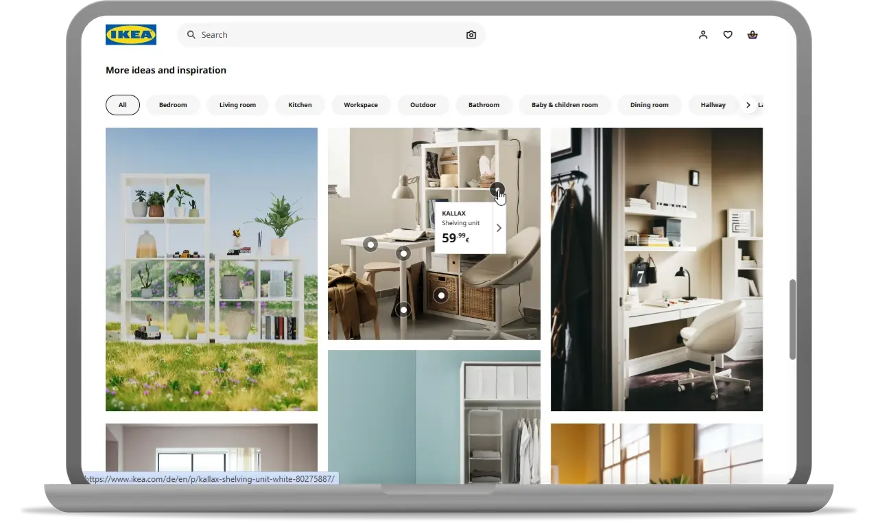
IKEA takes an interesting approach to this. Instead of product lists or grids, you get photos with dots around specific products. If one of them catches the customer’s attention, they get all the information they need by hovering their mouse over the product, along with a link to the product page.
Recommended reading:
How to Create a Gift Guide That Will Inspire Your Customers
Made in Europe? 100% vegan? Free repairs for life? Make your unique selling propositions clear and prominent. Don't hide what makes you special. Promote your USP at the top of your stage!
If your main differentiator is buried in your footer, you're wasting a competitive advantage.
Consider how your USP connects to current consumer concerns. Sustainability, ethical sourcing, and social responsibility resonate strongly with modern shoppers.
It’s true that both desktop and mobile screens are getting bigger, but that doesn’t mean you can (or should) cram as many products on the homepage as possible.
Quite the contrary, putting just a few products can make a stronger impression. On one side, you prevent decision paralysis related to too many items to choose from. On the other hand, your homepage works better, as you don’t have to worry about loading too many products at once.
Progressive disclosure works especially well for complex products or categories. Instead of overwhelming visitors with technical specifications from the get-go, start with benefits and let interested customers drill down into the details.
Your homepage is your digital storefront. Even if it doesn't get as much traffic as product pages, it's equally important for building trust and driving conversions.
The strategies above help you create a homepage that works harder for your business. Focus on trust, clarity, and the user experience to turn visitors into loyal customers.
This article was originally published and translated from our Polish blog: Skuteczna strona główna sklepu online: jak ją zaprojektować?
06/08/25