


Collect and Display Reviews Effectively to Sell More
Learn best practices for collecting and displaying customer reviews to enhance your shop's visibility, boost conversions, and build trust with shoppers.
Creating a perfect landing page is not easy, but it is possible with the right strategy. An effective landing page is an essential element of any online marketing campaign because they boost conversion rates while also helping to keep costs down.
Table of contents:
A landing page is a standalone webpage created specifically for an advertising or marketing campaign. It is where the visitor “lands” after clicking on an ad.
With online advertisements, users who click on your ad are directed to a web page of your choosing.
While you could send them to your homepage, a better idea would be to send them to a specific page you've created just for this campaign.
There are a few good reasons to create a landing page specific to each campaign.
From a marketing perspective, having a unique landing page gives you the chance to reinforce the message from the ad that was clicked on. In essence, you’re focusing your marketing message instead of letting users aimlessly browse your website without any guidance.
It makes much more sense to send them to a product page where they can directly learn more about the product that caught their attention in the ad. Make it easy for their next mouse-click to be an action you want them to take (i.e. "Buy now" or "Add to cart").

From an economic perspective, it makes sense to create a campaign-specific landing page, too.
If users end up on a homepage and can't find what they clicked on in the first place, they may quickly leave. This can have a negative impact on your campaigns!
When people leave your page quickly, your site's bounce rate (the percentage of page visitors who navigate away from the site after viewing only that page) increases. The bounce rate is, in fact, a factor for Google Ads' prices.
In other words, ads that have a higher bounce rate become more expensive. Google & Facebook love ads that convert because they get paid more when a user converts into a customer. Therefore, advertisers with high conversion rates are rewarded with lower costs-per-click. This system is designed to encourage advertisers to create high-quality campaigns!
Creating a perfect landing page isn’t rocket science. The most effective landing pages tend to have a few things in common. Let's explore some of those common traits.
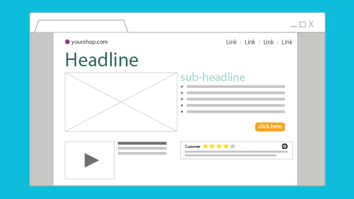
First things first, you've got to have a headline to grab your user's attention. Make the headline grab their attention. Oftentimes, this might refer to a special deal. Otherwise, you could reference your company's brand and specifically, your brand's voice. Speak the customer's language. Entice them to want to keep reading!
Your landing page's headline should also be directly connected to the ad campaign that they've clicked on.

Shutterstock/HstrongART
For example, imagine you are a subscription-based business. You've decided to have a promotion giving away the gold subscription for the first 3 months, after which they'll have the standard subscription for the rest of their contract.
With this in mind, your ad will surely mention the "3 months of gold membership free". This will inspire users to click on your ad to learn more. Therefore, your landing page's headline should also reference this special deal. For example, "Your 3 months of gold membership are only a few clicks away". The user should seamlessly arrive on the page and simply continue reading.
If landing page headlines don't match the advertisements that brought them there, there is a good chance the user will be confused. It goes without saying that confusion is not the first reaction you want your audience to have when they visit your page, especially if you're paying for those visitors!
Also, keep in mind that your ad and headline should have some keywords in common. Ideally, you'll be using the same keywords that were used in targeting those users in the first place. Not only does this make logical sense for users, but it also makes technical sense for Google; again, keeping your costs down.
There's not much to say here. In fact, you might not even have a sub-headline on your page. A sub-headline can be helpful if you can't squeeze your entire main message into the headline. The sub-headline can support the headline with additional, complementary information.
Keep in mind, of course, that the sub-headline will most likely be the second thing users read upon arriving on your landing page.
If your landing page is actually a specific product page, there's a decent chance that your supporting text will be the product description (although this isn't always the case).
Let's assume for a moment that you will have a separate section for the product description. Your first, shorter text should be exactly that: short.
Stick to a few main features or ideas that you want the reader to focus on. Perhaps a short paragraph and 3-4 bullet points of information. Keep it short and sweet. Just like everything else on your (perfect) landing page so far, use this text to inspire people to learn more and explore the rest of your page.
Assuming this is a product page, you may want to have a separate product description area. This is done by many companies, most notably, the boring but effective product pages on Amazon and other marketplaces.
Recommended reading:
Should I Only Sell in Marketplaces Like Amazon and eBay or Focus on My Own Website?
This separate (or additional) product description can be lower on the page. This longer section can really inform users about your product in detail. If you've got them reading this far, then you've done very well on the previous steps of the marketing journey!
This section should also contain some of your main keywords, just like in the headline. Of course, you may include multiple keywords here, as you very well may want to get this landing page to rank in search engines organically! Surely, you want some free traffic as well, right? So, keep a good keyword strategy in mind and use this area to inform your users while helping it rank higher as well.
Your perfect landing page naturally also has perfect images! Hopefully, this concept hasn't surprised you. Regardless of that, let's see what goes into good images.
If your landing page is not a classic product page, you'll want to consider having a main image in the stage (upper-most section of your landing page). This image should be compelling.
Much like the keyword of the headline, the main image would ideally be connected to the image in the ad. Of course, it's possible that the ad was a text ad and had no image. In this case, try to build a connection with the targeted keyword and the main image.
Any additional product images should be informational, just like an extended product description. Show images of the product from different angles. Show the product in use. All in all, you should keep in mind that the more images, the better.

Shutterstock/insta_photos
Seriously, you can never have too many product images. This not only gives users more information, but it also shows transparency from your side. You've got nothing to hide, and you're proving that by showing your product in all its glory!
Recommended reading:
10 Tips for Perfect Product Images (+ checklist)
We undoubtedly entered the era of video content a few years ago. People are watching more and more videos every day, whether it's on their desktops or their mobile devices.
Although it's not quite standard yet, it's getting there: a good landing page has videos. This is particularly true if your landing page is a product page.
However, one way or another, video content is engaging. Many people prefer watching a video to reading walls of text. A good video can also give insights into your business. A professional, well-thought-out video can reflect on your brand very well.
Whether it's an explainer video, a promotional video, or even just a review video, the presence of videos will increase the chance of engagement with the user.
Just as with the images, videos also communicate a level of transparency that helps your landing page (and your brand) build trust with the user.
You've got the basics of a perfect landing page covered. Now, it's time to learn about those next steps to take; those details that can help those users turn into customers.
Although online shopping has become a staple of our society, there will always be a certain level of mistrust or scepticism that exists in the digital sphere. This is particularly true with smaller shops (i.e. unknown stores).
Simply having one good experience with an online shop is enough to build trust for future purchases. However, what about that first-time visitor? The one who's never shopped (or heard of your brand) before?
Building trustworthiness is important here! You can do this in multiple ways:
Part of what has made Amazon so successful is that it was one of the first online shops to implement product reviews on its product pages. Being able to read feedback directly from fellow consumers was a gift to consumers everywhere. It's really the biggest differentiator from shopping in physical shops. Having access to other shoppers' experiences with a click is incredibly helpful.

If you're a single product shop, it might be enough to share shop reviews, but if you sell multiple items, then make sure you collect product reviews as well. Display the star ratings prominently towards the top of the page. You may even want to share a particularly good snippet from a positive review.
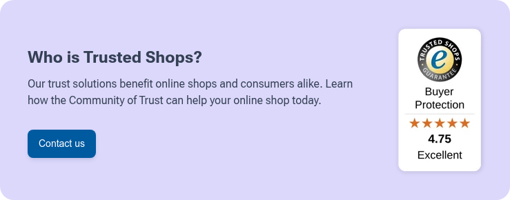
It's worth noting that if you work with a Google-certified reviews partner (like Trusted Shops), you can get your star ratings to display in your Google Ads, which can boost the click-through rates of your ads significantly.

Another option when it comes to building trustworthiness on a landing page is to display any third-party accreditation for consumers to find easily. If it's important to your target audience, then make sure they know about it.
For example, the Vegan logo is something that might be of interest to your audience. Fair Trade is another one.
Besides such ethical certificates, you have options to showcase a trustmark that is there to protect buyers.
The Trusted Shops Trustmark shows users that the shop meets specific guidelines based on EU regulations that make the shop trustworthy. On top of that, it is backed by the Buyer Protection, which entitles shoppers to a 30-day Buyer Protection against non-delivery or non-refunds on legal returns.

Generally speaking, most pages should have one clear action that you want the user to take. This usually comes in the form of a button, often called the call-to-action button.
When it comes to product pages, the call-to-action should be quite clear: Buy now! or Add to cart are typical call-to-action buttons. Make sure they stand out and are easy to find.
However, there is the possibility that you are not sending users to a typical product page. If you are running a brand awareness campaign or sell a service rather than a product, you might have created a landing page in order to collect leads (i.e. potential clients).
If this is the case, try your best to limit your call-to-action to one single action. Having too many calls-to-action can be confusing and may lead to unwanted actions. For example, sometimes a landing page may remove the standard navigation at the top of the page, therefore limiting the user's ability to "wander off".
We've referred to "the perfect landing page" a lot in this article. The truth is that there is no such thing as a perfect landing page. What does exist is an optimised landing page.
This means that nothing should be written in stone. Rules are made to be broken, but of course, a lot of this advice is based on wisdom and experience. The point, however, is that what might work for others might not work for you and vice versa. That is why you should feel encouraged to test things out.
You can run A/B tests for things like button texts. For example, you could test "Buy now" and "Add to cart".
Recommended reading:
What is A/B Testing and Why Your Online Shop Should Be Doing It
You can test header images or headline texts as well as product descriptions. What's important is to have a strategy in mind and test one thing at a time. If you test too many variations on different elements, it will be hard to pinpoint which change had the biggest impact.
As for the strategy, come up with something you really want to test. For example, images that have human faces vs product closeups. With texts, you can test questions vs imperative sentences. The possibilities are endless, but it's important to be strategic and thoughtful with your tests.
We’ve created a checklist for you to download to summarise what you've learned above. It labels (on a "map") and describes the most important elements of the perfect landing page.
Get your copy of the perfect landing page checklist now! Add it to your library of e-commerce knowledge by clicking on the banner below: