Why Do My Google Stars Not Appear?
Sometimes your Google stars don't appear in the search results. Here are a few reasons why this might be happening and some tips to fix them.
Pop-ups have been public enemy number one for internet users since before Facebook was a household name. Like a pest, just when you thought you’ve stomped out the last one, another one was hiding in that dark corner of your screen. In a post-apocalyptic where everything is destroyed, pop-ups will have survived!
Clearly I’m really enjoying writing these poetic analogies of my hatred for pop-ups, but am I being unfair? Is there a place in the ecology of the internet for these little pests?
When used correctly, pop-ups can be a powerful tool for online shops. You can increase your mailing lists, or advertise a new product/service. You can also offer a discount if it appears someone is going to leave your site.
There are a lot of possibilities, but the key word here is “relevance”. If you’re going to risk turning a customer off with a pop-up, make sure that the information you’re giving them offers them value. Let’s take a look at what kinds of pop-ups there are, how to use them, and the advantages and disadvantages of each one.
There are many kinds of pop-ups these days. Some are more intrusive than others, and generally, “intrusive pop-ups” should be avoided. You might be thinking “All pop-ups are intrusive!”
You probably have a point there, so let me reword that. If you’re thinking about using them in your shop, you should be asking yourself “Is this pop-up relevant for my audience?” In other words, would the pop-up bring any value to your customers?
Let’s break down the most popular kinds of pop-ups there are, and why they may or may not be right for your online shop.
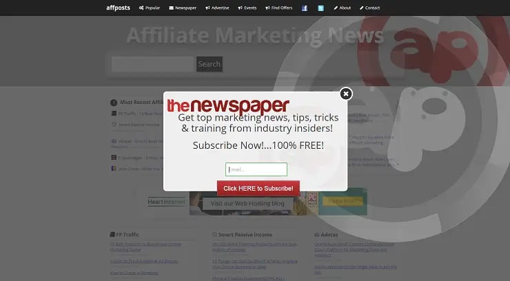
Some call this the class pop-up. Enter the site and pop!
Entrance pop-ups are the ones that appear as soon as you land on a page. These are often considered the most annoying of all pop-ups. This is because it shows up so early that the visitor hasn’t even had a chance to get to know your website yet. I would generally try to avoid these if possible, but some benefits do exist.
With entrance pop-ups you can inform your potential customers of any special events (like a holiday sale), or a new offer (free shipping on orders above £25).
Use of this should be limited to informational messages because new customers might be turned off by the sight of this if they don’t already know your store. Avoid asking customers to opt-in to anything or to give their emails straight away.
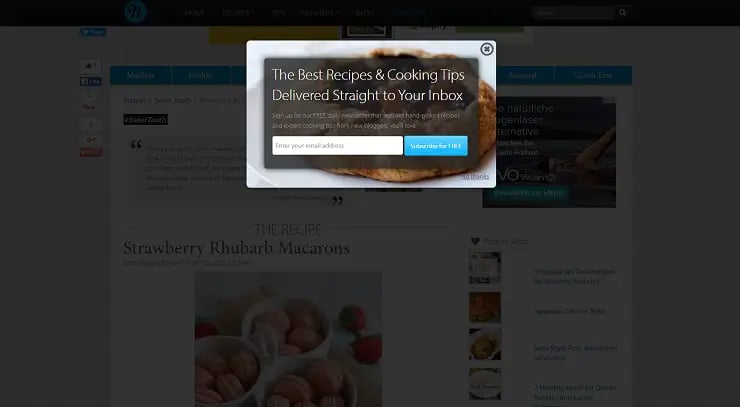
This pop-up showed up only on a recipe page.
These pop-ups appear on specific pages on your website and should correspond to the content offered on that given page. For example, if someone is looking at a jacket on your site, you may want to inform them that there are only two left in stock or that there is a jackets sale that they may want to check out with a provided link.
These make much more sense than entrance pop-ups as they tend to be related to the page being visited. These can be targeted based on what interests the potential customer has instead of a blanket statement on your homepage.
A pop-up is still a pop-up, right? Though the context of seeing these pop-ups makes more sense, there is still the risk of turning off a potential customer.

This time-based pop-up slid in on the right side of the screen after about 15 seconds.
These little guys show up, as you might have guessed, after a certain amount of time has been spent on a page. This can range anywhere from a few seconds to a few minutes. We would recommend at least 20 seconds if not longer.
Time-based pop-ups allow a new visitor to browse around and get a feeling for your website. After an appropriate amount of time, a pop up can appear showing any relevant information you want them to see. Maybe there’s a sale coming up next week. Perhaps, shipping is free for a limited time.
Getting the timing right here is tricky. You want to give the visitor enough time to get to know your site, but also inform them before they leave your site.
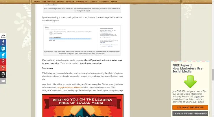
This little guy on the right side showed up after scrolling down about 70% of the page.
These are similar to time-based pop-ups, but as the name suggests, these show up at a certain point on the page instead of at a certain time. If you’re showing this on your blog, it’s useful to show this pop-up at the end of the article instead of the middle. These pop-ups work particularly well if you want to build your email list and gain some new subscribers.
These can work wonders as they are less distracting to the reader. If they have had a chance to get to know your site, they will be much more likely to know whether they want to subscribe to your website or whatever your call to action might be.
These work particularly well for subscriptions if you have a blog on your site because the timing is perfect. On the other hand, if your website is strictly a shop offering physical products, then these might not be as effective. Visitors might not reach the point on the page where the pop-up shows up, thus never having the chance to see your offer.
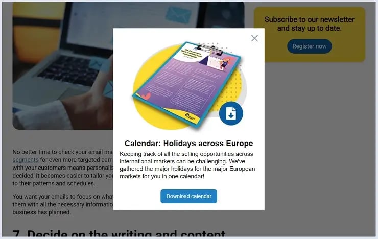
Before leaving the Trusted Shops page, you might get offered an interesting whitepaper.
These are the relatively new, super-evolved pop-ups of the 21st century! All kidding aside, these pop-ups can really work well when used correctly. Exit-intent pop-ups cleverly reveal themselves when the user’s mouse moves towards the “X” button in their browser. Essentially, this is a last resort in getting a visitor’s attention before they leave your website entirely.
I have to admit that exit-intent pop-ups have totally worked on me. I was doing some shopping on my mobile and added a couple items to my shopping cart. I was a bit hesitant and decided that I would just leave the items in my cart and think things over before finalising my purchase.
Right when I exed out, a little pop-up appeared offering me 5% off of my purchase if I checked out right now. Fast forward two weeks later and I’m enjoying my bottle opener/portable USB cable. (Sure it’s kind of useless, but it was 5% cheaper than what others have paid for it, so that's a win in my book!)
This pop-up can also be useful to gain subscribers for your email list. Even if someone hasn’t purchased anything, they might be interested in knowing about a sale and would be open to adding themselves to your mailing list.
As with any of these pop-ups, you risk annoying your customer. I would say the risk is very low, however, because this customer has already decided to leave your shop. One last shot at trying to win them over, or get their email address, is probably worth the risk.
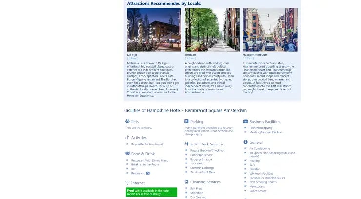
That little, green, non-clickable pop-up on the left showed up after scrolling to grab my attention. Precious WiFi!
These are probably considered the least intrusive pop-ups, yet can still be incredibly effective. You see these on some hotel booking sites (like booking.com). These pop-ups usually show up in the corner of a page and remain static on the page as the visitor scrolls.
Pop-outs are usually used to inform, not to get any information from the visitor. At the same time, the pop-up doesn’t cover up any content so it’s actually quite subtle.
A subtle pop-up? Hard to believe, I know. Some examples of how to use this pop-up are showing how many other users are looking at this product right now or letting a customer know that the current price is historically low for this item. They can even highlight the fact that this product got some great reviews.
There are not so many negatives to this sort of pop-out. As we mentioned, it’s not intrusive so a visitor doesn’t even have to ex out of the pop-up to continue browsing the site. They can just ignore it and carry on with what they were doing.
However, one negative element here is that it can be a bit tricky to measure their effectiveness because these pop-ups aren’t always clickable and don’t really have a call-to-action (CTA).
Therefore, the only way to test them is by doing A/B tests. Let some users browse the page with the pop-up and others without it. That would be one way of seeing if the pop-out is being effective and increasing check-outs.

Shutterstock/Pretty Vectors
We mentioned a few examples as to what content might be in a pop-up. What else might you want to express in one? Here are few more examples:
If you’re a content-based page (like a blog), then offering free downloads, like an e-book or an infographic could be a great idea
Offer discounts. For example, if they are abandoning their shopping carts, offer them a discount code
Introduce a new product line like winter jackets
Get them to take a quick survey to help you improve their shopping experience (offer a discount code if they agree to participate)
Inform your visitors of a contest you’re running
Ask if they want to subscribe to your newsletter to get updates on sales, new products, etc. This way you can try to win them over with your email marketing campaigns.
Offer “related items” after purchasing specific items. Since you don’t want to disrupt the check-out process, show customers what items complement the one they just purchased (e.g. a memory card for the camera they just bought) after the check-out process. If you make it easy for them to add this to their original order, it could be an effective way to increase the average shopping carts.
As mentioned above, pop-ups can be used for a variety of reasons. What’s most important is to keep context and relevance in mind. If your pop-up will really add value to the visitor, then go for it. Just don’t hit them with the pop-up too early or they might leave your site in a hurry.
You might want to run A/B tests for any pop-up you add to your website to see how effective they really are. If you notice anything that is massively affecting viewership or conversions, you might have to give up on the pop-up experiment. However, if you stick to the tips and guidelines above, you might find pop-ups to be really beneficial to your shop.
13/04/17Sometimes your Google stars don't appear in the search results. Here are a few reasons why this might be happening and some tips to fix them.