


Collect and Display Reviews Effectively to Sell More
Learn best practices for collecting and displaying customer reviews to enhance your shop's visibility, boost conversions, and build trust with shoppers.
Having a professional website that isn’t easy to navigate is like having an expensive copy machine that always gets paper jams: people will get frustrated and simply walk away.
In today’s blog, we’ll be looking at some basic features that will make your website easy to navigate and reduce confusion for shoppers. We'll also provide some examples of easy-to-navigate websites.
Remember, an easy-to-browse site can immensely impact the customer experience and thus impact your sales!
Table of contents:
They don’t call it a navigation bar for nothing. This should be the first element of your website that you look at with a critical eye. After all, you can't expect to be considered a good website without a good navigation bar.
For starters, you’ll want to make sure that you choose the right categories for the navigation bar. As a retailer, make sure you separate your product groups properly and don’t have too many first-tier categories.
From a design perspective, you’ll also want to give your navigation bar a little contrast from the surrounding elements on your page. This will make the bar pop a bit more and make it easier for shoppers to know where they are in case they end up on your page from a referral site. In fact, according to a study from KoMarketing, 50% of visitors will use the navigation menu to orient themselves.
Another point to consider for your navigation bar is whether you want to make it sticky.
A sticky navigation bar means that it stays at the top of the screen no matter how far a user scrolls down. This makes navigation much faster and lets customers reach more pages with less confusion.
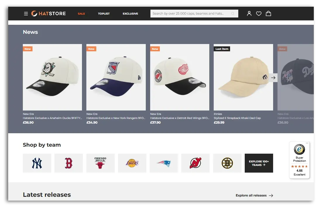
The navigation on the Hatstore website stays at the top of the page, allowing users to click on the most popular links at any time.
(Source: Hatstore)
Finally, it might also be worth considering adding a “mega menu” to your navigation bar. You might recognise this style from large retailers like Ikea or Amazon. If you have a large product line or a long product category list, then it makes sense to have these large style “mega menus” as they can help customers orient themselves and find what they’re looking for relatively quickly.
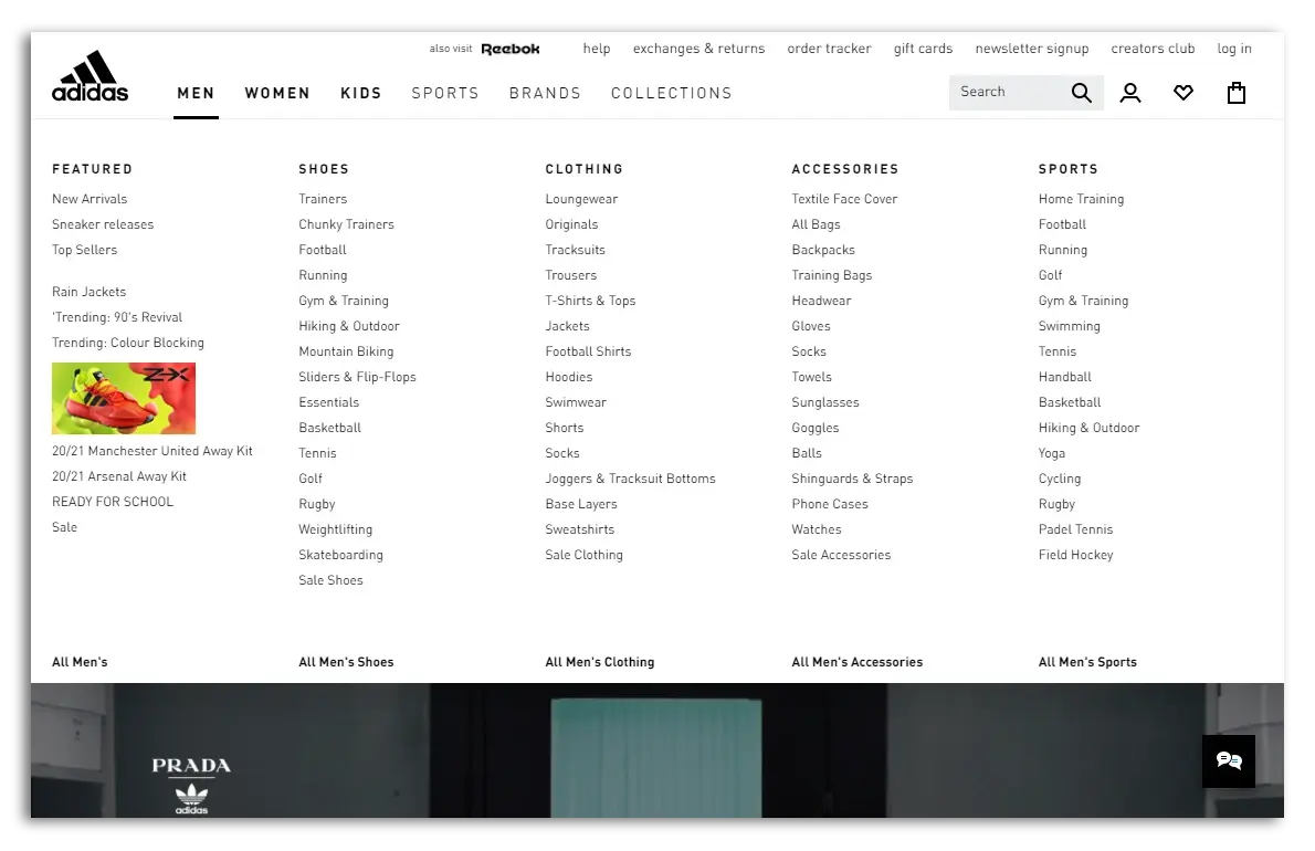
Adidas has a lot of product categories. Once you click on a main category in the navigation (e.g. Men), the mega menu appears below it (Source: Adidas)
BONUS TIP: Your company logo is probably found in the top left corner of your page. Make sure clicking on this takes users back to the homepage. This is pretty much standard practice these days.
If you’re not familiar with the term breadcrumbs, think of them as a trail left behind so that your shoppers can work their way backwards and find their way around your site. Not only does this help customers figure out where they are, but they can also use those links to get an overview of a specific category.
Let’s say that they stumbled on the page due to an ad campaign or a social media share, for example. Although they were initially attracted to the product shown to them, they would also like to see what other products you have in that particular category. Breadcrumbs help them find those other products that you sell.
Breadcrumbs can have an impact on your SEO as well as your ad campaigns. If users end up clicking around to other pages on your site, this reduces your page's bounce rate, which signals to Google that your ad/product page/blog article was relevant to the user who clicked on it. This can lead to higher rankings for your keywords and lower costs for your ad campaigns.
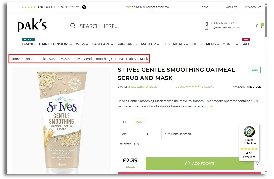
PakCosmetics' product pages have breadcrumbs (highlighted in red box), so that users can move backwards through the product categories and explore the site.
Having an in-site search bar can be especially helpful for e‑commerce sites that sell a lot of different products (just like the mega menu). Think of a search bar as a sales associate in a brick-and-mortar shop.
If you, as a customer, cannot find the product you’re looking for in a store, you would ask an employee, right? And if there is no one to be found in the store, at some point you’d probably just leave in frustration, wouldn't you? (I've definitely done that!)

Shutterstock/astarot
Therefore, the search bar is the equivalent of a sales associate helping a customer find a product that they couldn't find on their own. It happens all the time, both online and offline.
Depending on the types of products you sell, you should consider getting a search tool that can include keywords, ingredients, sport, model number, etc. Either way, no search term should end up with “no results”.
Recommended reading:
How to Improve the Search Bar on Your Website to Increase Conversions
Also, make sure the search tool is prominent at the top of the page. Perhaps it’s “sticky” just like the navigation bar. Placing it next to your company logo will make it pretty hard to miss.
Swiftype, and Addsearch are popular solutions that include features such as synonym results, spelling error tolerance, autocomplete suggestions and more.
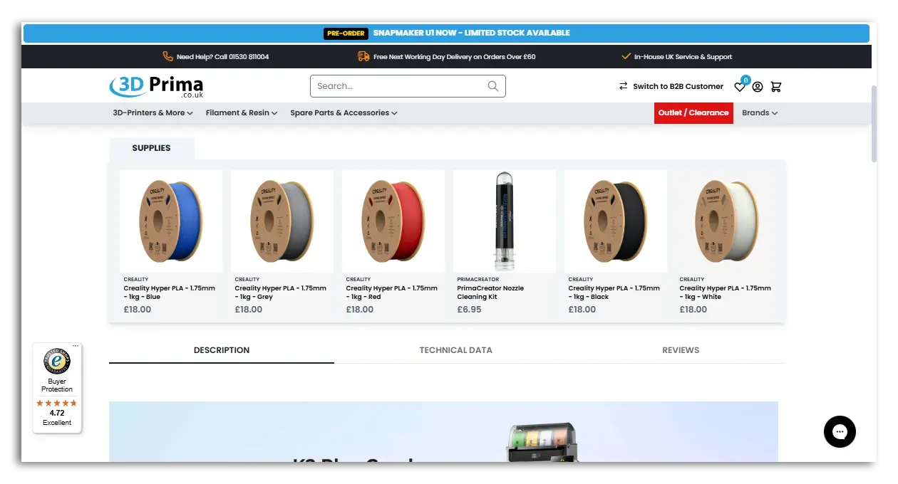
The search bar here is hard to miss.
(Source: 3D Prima)
Customers like consistency when they’re browsing a website. Each page should have the same structure, so that the customer can find their way to a new page or back to a previous page very easily. In other words, you should have a "template mentality" when it comes to the general design and structure of your online shop.
Not only do shoppers want consistency on one website, but they like it across the internet as well. Though it’s nice to try to be innovative with your website, some things should be "standardised" when it comes to online shop website design.
For example, icons like the shopping basket and links to the homepage from the company logo are pretty much standard across the internet.
If customers have to figure out too many things that are pretty much standardised on other websites, this could become frustrating and lead to them leaving the site. Use creativity with images and headlines, but keep the classic elements (like product images and descriptions) clear and easy to find.
Another point on consistency is about having your mobile design be responsive. The mobile website experience should be very similar to the experience on desktop devices. Many shopping journeys occur across multiple platforms (e.g. browsing on mobile and completing purchases on desktops), so your shoppers will want to navigate around your website just as easily when they change devices.

This rule is pretty simple. Although it’s a bit controversial, many designers believe in this rule very strongly. It also highlights the importance of a good navigation bar as well as the other points mentioned in this article.
Basically, the rule states that a user should be able to find any bit of information within 3 mouse clicks. With a good navigation bar (that includes a mega menu and search function), this shouldn’t be a problem.
Even if you don’t hold true to this rule very strictly, the concept is good to keep in mind. There’s nothing worse than a potential customer getting frustrated and leaving your site because they couldn’t find what they were looking for due to poor site structure.
Making your website easier to navigate really comes down to ease and familiarity. Many online shops have a "standard" look that shoppers are accustomed to. Make their journey seem easy and familiar, and they won't have any issues, whether that refers to the checkout or just browsing around your other pages.
