


What Should Your E‑Commerce Homepage Look Like? Tips & Examples
Your homepage has a few seconds to make or break a sale. Learn the essential homepage best practices that build trust and turn visitors into customers.
You might think that creating forms for your online shop is neither a difficult nor an important task for shop owners. However, it’s worth taking a closer look at the art of creating forms. After all, forms are one of the most important elements an online shop has.
In fact, forms can lead to more conversions – if they’ve been created and set up in the right way. There are different kinds of forms that are essential to your business’s success in the online world: order forms, contact forms, newsletter subscription forms, etc. Here is what to keep in mind when creating forms for your online shop.
For customers, filling out any kind of form – including digital ones – is associated with an unpleasant chore. When giving away your data, a form can make you feel like you’re obliging to something.
Therefore, customers usually want to get this over with as quickly as possible. However, if they find that the form in your online shop takes too much time to fill out, they will likely quit their order and leave your shop’s website.

That is why it's quite important to limit the number of fields in your forms. Make sure you only ask potential customers to fill out a form when it comes to important matters. For example, if you need their contact information to process their order.
The more redundant fields there are in your forms, the lower the chance of increasing conversions will be.
Popular CRM and marketing platform, Hubspot, conducted research confirming this point. The data gathered by Hubspot shows that customers are most willing to fill out forms containing no more than three fields. This kind of form led to a 25% increase in conversions.
Forms containing two to three text fields helped increase the shops’ conversions by 20%.
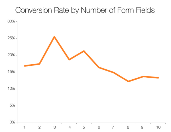
Source: Hubspot Blog
Speaking of the optimal number of fields for your forms, you also need to consider that your website needs to be mobile-friendly.
More and more customers prefer using mobile devices to shop online. That is why you need to make your forms as simple, readable, and user-friendly as possible for both mobile and desktop users.
Offering an autocomplete option is one way to do so. You could also introduce text suggestions for some of the form’s boxes.
In other words: just keep it simple. Try to avoid distracting colourful backgrounds or fonts.
Recommended Reading:
What is UX and Why is It Important for Your Online Shop?
Also, keep in mind that you should avoid asking for complex information or questions. Instead, one text box should only correspond to one issue.
As we already touched on in the previous section, we highly recommend you to only ask for relevant information in your website’s forms.
One thing you should think about before adding it to your form is the phone number. When it comes to phone numbers, this is information that many customers feel uneasy providing on the internet. Many fear they might receive intrusive phone calls or spam text messages.
In fact, many potential customers tend to abandon their shopping cart or leave a website when they see that they need to enter their phone number.
In other words: asking your potential customers for their phone number might, in fact, lead to a lower conversion rate for your online shop.
If the customer’s phone number isn’t essential information that you need to process their order, consider removing this field from your forms.
Alternatively, you could allow your customers to decide for themselves if they want to provide this information to you or not. You could then mark this field as “optional”.

Source: shutterstock/PRASUWAN
When creating a form, nothing should be random.
Here are some things you should bear in mind when designing the layout of your form:
While a horizontal layout for your form (a template where the corresponding labels are to the left of the field) saves space, a vertical layout (where the labels are placed above the fields) is better in terms of user-friendliness.
This is because users don’t have to move their gaze as they only need to focus on a single vertical line on their screen, making the vertical template way more intuitive than the horizontal layout.
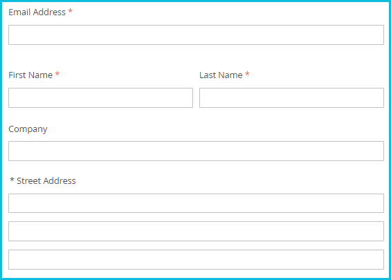
While placing labels in the boxes of your form can save a lot of space, it can also cause problems for the user. When filling in a field, the customer will then have to delete the text to check what they are actually typing.
In other words: potential customers will have to spend more time filling in your form which is something that might keep them from completing their order.
Therefore, it would be better to place the labels above the corresponding field of your form, like in the example below:
Recommended Reading:
How to Calculate and Boost Your Conversion Rates
Make sure that the template you use for your forms is as intuitive as possible. Start with the most important information and then move on to less important ones.
The user experience will also be better if you’re arranging fields by topic - e.g. personal data, contact (e-mail, optional phone) and address. Remember, however, to limit yourself to one column per topic only.
For your potential customers, it should be clear which information he or she is actually required to fill in and which fields are optional. The best way to do so would be to mark required fields with a simple *.
The most important thing is to let the user know about the required data they need to enter right away. This way, the customer immediately knows what data they need to provide.
Having them find out, for example, through an error message pop-up, would impair the user experience on your website.
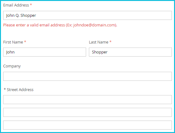
Of course, mistakes can happen when customers fill in your form. But did you know that how you communicate an incorrect fill-in can also affect your conversion rate?
To avoid any negative impacts on your conversion rate, make sure to provide your customers with detailed information about the error, for example by marking the field(s) where the error was made or have them displayed in a different colour.
Next to these fields, you need to inform them what went wrong, e.g. if the customer used a forbidden character or forgot to fill in a box. You can also give an example of a correct fill-in to make it even clearer what actually went wrong.
A simple "An error has occurred" message, without clarifying what happened, forces the customer to look for the mistake on their own, thus consequently discouraging them from further completing the form.
Example of an error message
Another thing, you should try to avoid: don’t clear out all information in the fields that were filled in correctly after informing them of an error.
If you clear this information, the user will have to do the same work twice, or even give up on the order altogether. Make sure to only clear the fields where an error has occurred.
Now, let’s talk about the most important element of an effective form in online shops: the CTA (call-to-action). This button is supposed to be located just below the form and encourage the user to click on it.
For the user, it should be clear what will happen after they’ve clicked on the button (e.g. submitting their data to complete their order).
Try to have a more engaging message than a simple "Submit". Although it is an universal option that you could use for different forms, it is advisable to use a more specific message for your CTA button, for example "Place order", "Sign up for free" or "Proceed to checkout".
As with most things in online marketing, the most important thing when it comes to e-commerce forms is to analyse your performance and draw conclusions.
Not sure which field layout or CTA will be the most effective one and will lead to a better conversion? A/B tests, for example, will help you find out.
You can continuously keep an eye on the performance of your forms with tools such as Google Analytics or HotJar.
HotJar, for example, is particularly helpful because it gives you access to a so-called heat map of your website pages, allowing you to see which sections or elements are clicked the most. You also have the option to obtain reports related to the effectiveness of forms.
...
Do you want to know what else you can do to increase the conversions and sales in your online shop? Download our whitepaper:

This article was originally published on the Polish Trusted Shops Blog: Jak zwiększyć konwersję w e-sklepie za pomocą formularza?
15/03/22